


Could the exquisite, hand-dyed silk of a peach Chikankari lehenga transform into a completely different shade once it leaves the studio and enters the crisp, natural light of a Toronto afternoon? You likely remember the 2015 viral sensation that left millions of people arguing over a single image, desperately asking what is the dress colour while seeing two entirely different palettes. It's a frustrating reality for any woman who values the soul of slow fashion, as the digital glow of a smartphone often fails to capture the intricate depth of heritage textiles.
We understand the hesitation that comes with selecting a specific hue for a milestone event, especially when the nuances of artisanal dyes are so delicate. This article explores the biological and environmental factors that dictate how we perceive colour, from the way light hits a karigar's needlework to the settings on your computer screen. You will learn how to evaluate fabric tones with confidence, ensuring the ethereal garment you receive from Lucknow Threads matches the timeless elegance you envisioned. We will bridge the gap between technical science and the poetic beauty of Awadhi craftsmanship.
Key Takeaways
- Revisit the science behind the viral question "what is the dress colour" to understand how your brain and lighting environments influence your perception of fabric.
- Navigate the complexities of online shopping by learning how to interpret the shimmering textures and intricate embroidery of authentic ethnic wear.
- Discover how to select a signature palette that resonates with your personal style while honoring the rich, storied heritage of handcrafted fashion.
- Uncover the artistry of hand-dyed textiles, where the subtle nuances of each piece celebrate the soul and deliberate craftsmanship of traditional karigars.
- Learn how to distinguish the depth of artisanal Chikankari from mass-produced garments, ensuring your wardrobe reflects a timeless elegance and cultural reverence.
The Viral Phenomenon: Revisiting the "What is the Dress Colour?" Debate
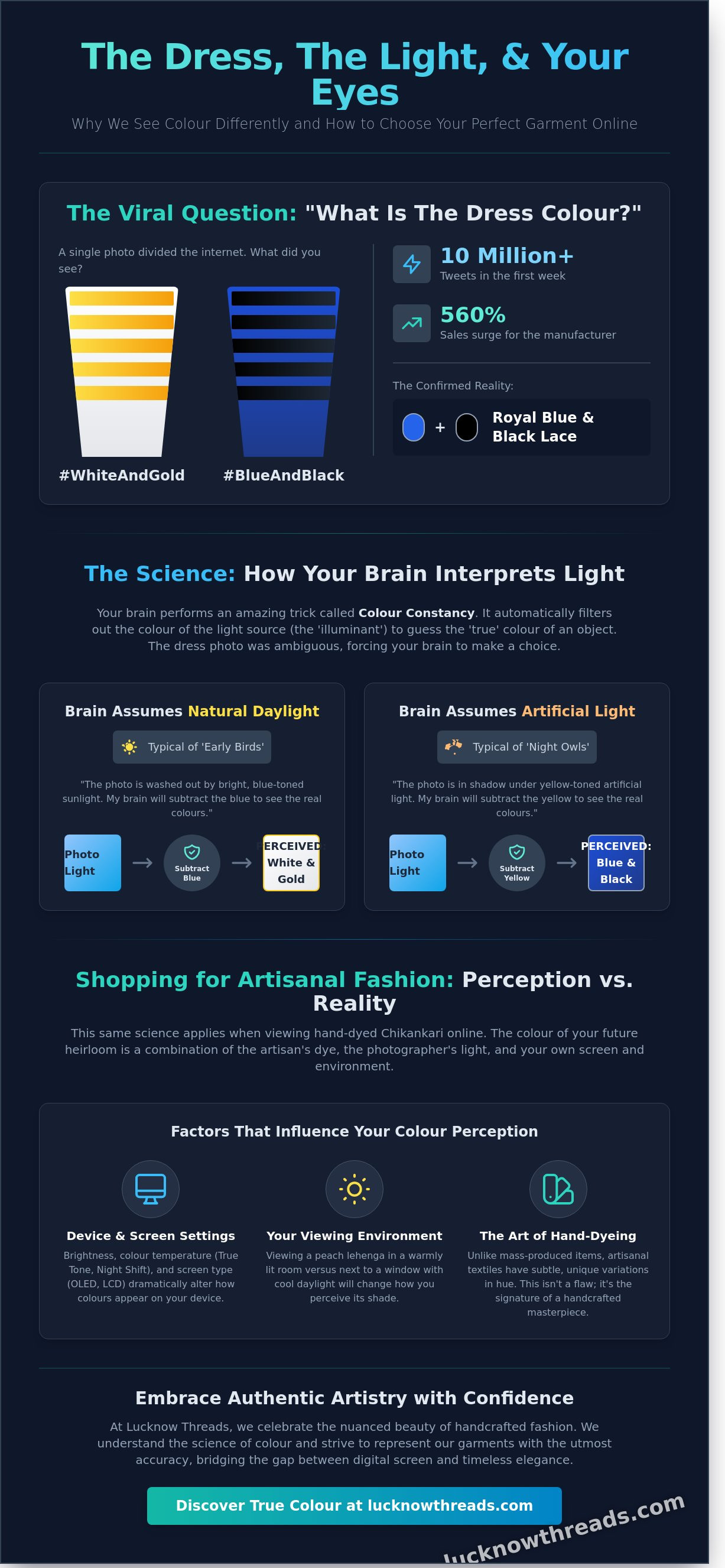
The intricate play of light upon fabric can often deceive the eye, a truth that became a global fascination on February 26, 2015. It was a day when a single, overexposed photograph forced millions to ask, what is the dress colour? This wasn't merely a fleeting trend; it was a profound moment where our collective understanding of reality felt fractured. The world found itself divided into two passionate camps: those who saw a regal #BlueAndBlack garment and those who perceived an ethereal #WhiteAndGold creation. This visual enigma transcended the boundaries of a simple fashion choice, evolving into a landmark study for vision scientists and photographers alike. It challenged the very foundation of how we perceive the artisanal beauty of the world around us.
The Initial Viral Spread
The journey began quite humbly on a Tumblr blog, shared by Caitlin McNeill after her friends disagreed over a wedding photo taken in Scotland. Within hours, the image cascaded across social media platforms with a velocity rarely seen in digital history. By the end of the first week, the post had generated over 10 million tweets, fueled by high-profile figures such as Taylor Swift and Kim Kardashian who shared their own conflicting perceptions. The Viral Phenomenon demonstrated how digital spaces can amplify a subjective sensory experience into a global debate. This wasn't just about a piece of clothing. It was about how our brains interpret the nuances of light and shadow, much like how a master weaver meticulously selects threads that change hue under different sunrises.
The Real Colours Confirmed
While the internet remained locked in a stalemate, the truth eventually emerged from the source of the garment's creation. The British retailer Roman Originals confirmed that the piece was actually a Royal Blue dress with black lace detailing. Despite this definitive evidence, the debate didn't simply vanish. The "correct" answer failed to satisfy those whose brains insisted on seeing gold and white, highlighting a fascinating biological quirk known as chromatic adaptation. The legacy of this dress persists in modern digital culture as a reminder that perception is often a personal journey, deeply connected to our environment.
- The dress was a bodycon design crafted from a blend of polyester, nylon, and spandex.
- Sales for the manufacturer surged by 560% within 24 hours of the viral spike.
- Scientific journals, including Current Biology, later published peer-reviewed studies analyzing why the photograph triggered such diverse neurobiological responses.
In the world of handcrafted fashion, we understand that a single dye can hold a thousand different stories depending on the light that graces it. This 2015 event taught us that even in a world of fast-paced media, we can still be stopped in our tracks by the simple, exquisite mystery of what is the dress colour. It reminds us to slow down and appreciate the nuances of every stitch and every shade, recognizing that beauty truly lies in the eye of the beholder.
The Science of Vision: How Our Brains Interpret Fabric and Light
The perception of a hand-embroidered masterpiece begins long before the light hits the retina. When you pause to wonder what is the dress colour, you're engaging with a complex neurological phenomenon known as colour constancy. This is the brain's sophisticated attempt to "discount" the illuminant, essentially filtering out the tint of the light source to uncover the true shade of the fabric. How Our Brains Interpret Fabric and Light involves a delicate dance between the eyes and the visual cortex; it's how a piece of ivory Chikankari remains white whether viewed under the golden glow of a sunset or the cool, blue tint of a Canadian winter morning.
Individual biology plays a surprising role in this interpretation. Research from 2015 involving over 13,000 participants suggested that our internal body clocks, or chronotypes, affect how we process light. Early birds, who spend more time in natural daylight, are more likely to discount blue light, whereas night owls, accustomed to artificial yellow light, may perceive the same fabric differently. This makes fashion an inherently personal experience, where the ethereal beauty of a garment is shaped by the unique neurological lens of the wearer.
- Warm Lighting: Enhances the richness of gold and earth tones, often found in traditional Awadhi palettes.
- Cool Lighting: Can make pastels appear more vibrant but might wash out the warmth of artisanal dyes.
- Chronotype Influence: Your sleep-wake cycle subtly shifts your brain's "white balance" throughout the day.
Chromatic Adaptation and Context
The way we see a hue is deeply influenced by the colours that surround it. In professional fashion photography, maintaining "white balance" is vital to ensure that the intricate details of a collection are captured with historical accuracy. To determine the true hue of a garment, the brain subconsciously evaluates the surrounding environment to guess whether a dark patch is a deep pigment or merely a cast shadow. This contextual guessing ensures that the artisanal warmth of the threadwork isn't lost to the eye. You can see this interplay of light and texture in our Ayat Soft Elegance collection, where subtle tones are defined by their surroundings.
The Role of Digital Displays
Digital shopping adds another layer of complexity because screens use RGB light to mimic physical fabric pigments. Your smartphone might display a vibrant shade of ruby while your laptop shows a muted crimson; this happens because of varying brightness settings and blue-light filters that distort the original vision of the karigars. While a digital screen offers a glimpse into the world of heritage fashion, the true depth of hand-embroidered textures is best appreciated in person, where natural light can dance across every meticulously crafted stitch. Understanding what is the dress colour requires acknowledging that your screen is a translator, not a mirror.
The Online Shopping Dilemma: Perception vs. Reality in Ethnic Fashion
Shopping for heritage pieces online often feels like a delicate gamble between light and shadow. When you find yourself staring at a screen asking what is the dress colour really like, you're participating in a modern digital phenomenon. The science behind the dress colour illusion explains that our brains interpret shades based on surrounding light sources, a reality that becomes even more complex with the intricate surfaces of ethnic wear. High-contrast editing and aggressive digital filters often strip away the soulful nuances of hand-dyed fabrics, leaving behind a flat image that fails to capture the garment's true spirit. Authentic craftsmanship requires a slower, more intentional approach to visual presentation to honour the artisan's work.
Chikankari and the Play of Light
The ethereal beauty of Chikankari lies in its three-dimensional nature. Every meticulous stitch of Murri or Phanda creates a tiny landscape of peaks and valleys on the fabric surface. This texture catches the light differently at every angle, producing natural highlights and soft shadows that machine-made embroidery simply can't replicate. While mass-produced garments offer a uniform, flat colour, artisanal pieces possess a living depth that changes as you move. For those seeking this level of detail, our Authentic Chikankari Kurta in Canada guide explores how these traditional techniques maintain their elegance through the lens of modern fashion. The way light dances across hand-stitched threads ensures the garment feels vibrant and alive, rather than static.
Screen Accuracy vs. Fabric Reality
Different textiles interact with digital sensors and human eyes in unique ways. Rayon has a subtle sheen that can brighten significantly under studio lights, while Modal offers a sophisticated matte finish that absorbs light, making colours appear deeper and more saturated. Chiffon, being translucent and airy, often shifts its hue based on the skin tone of the wearer or the lining worn underneath. This is why a shade labelled "Lavender" might appear as "Blush Pink" on a smartphone screen set to a warm night-shift mode. To ensure your expectations align with reality, it's helpful to look for specific markers in product descriptions:
- Fabric Sheen: Identify if the material is described as lustrous, pearlescent, or matte.
- Dye Technique: Hand-dyed pieces, common in Awadhi culture, will always have slight, beautiful variations that add character.
- Under-layers: Consider how the opacity of the fabric affects the final visible shade.
By understanding these variables, you can move beyond the surface-level question of what is the dress colour and appreciate the artisanal warmth of the piece. Whether you're ordering from a boutique in Montreal or a curator in Calgary, reading between the pixels helps you connect with the storied heritage of the craft. Authentic fashion isn't just about a hex code; it's about how the fabric breathes and glows in your own environment.
Selecting Your Signature Shade: A Guide to Timeless Ethnic Palettes
Choosing a garment is a ritual of self-expression that goes far beyond mere aesthetics. When you look in the mirror and ponder what is the dress colour, you're engaging with a tradition that spans centuries of Awadhi culture. In the heritage of Lucknow, every hue carries a specific weight and emotional resonance. Selecting a shade isn't just about following a trend; it's about finding a palette that honors your personal legacy while fitting seamlessly into a modern Canadian lifestyle. Research suggests that approximately 85% of shoppers cite color as the primary reason they purchase a particular item of clothing, proving that our emotional connection to the spectrum is profound.
The psychological impact of color in ethnic wear is significant. Red often symbolizes energy and celebration, while white represents the purity and peace found in the delicate stitches of a master karigar. To balance traditional significance with modern fashion sensibilities, you must consider the environment. A vibrant ensemble might feel perfectly at home during a Diwali celebration in the heart of Toronto, yet a softer palette may be more appropriate for an intimate family gathering in a sunlit Vancouver garden.
The Elegance of the Ayat Collection
The Ayat collection is built upon a philosophy of "Soft Elegance," where the whisper of pastels meets the profound depth of midnight shades. For those seeking evening grace, the Ayat- Black Rayon Chikankari Co-ord Set offers a silhouette that is both commanding and ethereal. The deep black rayon acts as a midnight canvas, allowing the white hand-embroidery to shine with architectural precision. During the day, the versatility of lavender and yellow comes to the forefront. These artisanal shades capture the natural light beautifully, making them ideal for daytime festivities where you want to project a sense of airy, effortless poise.
Bold Heritage and Royal Blooms
When the occasion demands a more assertive presence, the vibrant blues of the Layla collection provide a regal solution. These aren't just colors; they are statements of confidence that echo the boldness of historical queens. If you prefer a romantic touch, the Maira Royal Bloom collection features the exquisite appeal of onion pink paired with meticulous muqaish work. This metallic dotting technique adds a subtle shimmer that catches the light as you move. When guests at an event ask what is the dress colour, they're often captivated by how these heritage shades shift under different lighting conditions. To choose correctly, follow these guidelines:
- Morning events: Prioritize "Soft Elegance" pastels like lemon or seafoam to mirror the freshness of the day.
- Afternoon soirées: Opt for mid-tone lavenders or corals that maintain their vibrancy as the sun begins to dip.
- Formal evening galas: Trust in the timeless authority of deep blacks, royal blues, or the shimmering muqaish of the Maira collection.
Every piece from Lucknow Threads is handcrafted with love, ensuring that the soul of the artisan is woven into every thread. Whether you're celebrating a national holiday or a personal milestone, your chosen palette serves as a bridge between the storied past of Lucknow and your bright future in Canada.
Lucknow Threads: Where Authentic Artistry Meets True Colour
At Lucknow Threads, we understand that the viral debate surrounding what is the dress colour often stems from how light interacts with organic textures and artisanal dyes. For our brand, colour isn't just a static digital hex code; it's the living result of centuries-old techniques passed down through generations of Awadhi artisans. Our commitment lies in representing the true soul of Lucknowi craftsmanship, ensuring every thread reflects the heritage and sophisticated grace of the City of Nawabs.
The process of hand-dyeing is a central pillar of our slow fashion philosophy. Unlike mass-produced garments that rely on standardized chemical vats, our pieces are dyed in small batches where environmental factors play a significant role. In our production cycles, factors like the morning humidity in Lucknow or the specific mineral content of the water can shift a shade by a subtle 3% to 5% margin. This artisanal variability ensures that no two pieces are exactly identical. We bridge the 11,000-kilometre gap between traditional karigars and our global audience in Canada, offering a bridge between ancient skill and modern Canadian wardrobes. We invite you to experience fashion that values soul, patience, and heritage over the cold efficiency of mass production.
Curated Collections and Shop the Look
Visualizing how these ethereal fabrics behave in different lighting environments is essential for the discerning shopper. To assist with this, we've developed our Shop the Look feature. This tool allows you to see our garments in natural settings, which helps clarify any ambiguity regarding what is the dress colour in real-world conditions. Our photography is meticulously calibrated to capture the artisanal warmth of Chikankari, highlighting the interplay of light and shadow on every intricate stitch. For those seeking a deeper understanding of the luxury ethnic landscape, our Navigating Aza Fashions guide provides broader context on how we curate these timeless pieces for a sophisticated international market.
The Human Element of Every Stitch
Behind every exquisite kurta stands a karigar whose hands have often spent over 40 hours on a single intricate pattern. These artisans are the heartbeat of our brand, and we celebrate the slight variations in hand-embroidery as a hallmark of true authenticity. A machine can replicate a pattern perfectly, but it cannot replicate the rhythmic, poetic cadence of a human hand. These subtle differences in tension and stitch placement aren't flaws; they're the signature of the craftsman. We invite you to explore our full collection of handcrafted ethnic wear and discover a piece that resonates with your own sense of timeless elegance.
Elevate Your Wardrobe With Authentic Chromatic Grace
The 2015 debate surrounding what is the dress colour revealed how much our environment dictates our perception of fashion. Science tells us that our eyes process light differently, yet the soul of a garment remains constant when it's built on a foundation of genuine artistry. You've learned that selecting the right palette is a balance of understanding light and trusting the source of your attire. By focusing on heritage rather than fast fashion trends, you ensure your style remains timeless and true to your personal vision.
Lucknow Threads brings this clarity to your closet through sophisticated designs handcrafted by traditional artisans in Lucknow. Every piece in our collection represents a legacy of Awadhi culture, where karigars often dedicate over 150 hours to a single hand-embroidered masterpiece. We offer meticulously curated collections featuring authentic Muqaish and Chikankari, ensuring that the ethereal beauty you see online translates into a physical reality of exquisite texture and hue. It's time to embrace a wardrobe that honors the slow, deliberate process of traditional craft while meeting the high-fashion standards of a global audience.
Explore the Authentic Hues of our Chikankari Collections
Step into a world where every thread carries a story of elegance and every shade reflects the true heart of artisanal mastery.
Frequently Asked Questions
Was the viral dress actually blue and black or white and gold?
The original garment that sparked the global debate in 2015 was scientifically confirmed by the retailer to be royal blue and black lace. While a study published in Current Biology found that 57% of viewers initially saw white and gold, the physical reality remains a deep blue. This phenomenon occurs because our brains subtract the ambient light to perceive the true hue of the fabric.
Why do some people see different colours in the same photograph?
People perceive the same image differently due to a biological process called color constancy where the brain filters out background illumination. If your brain assumes the photo was taken in a cool, blue-toned shadow, you'll likely see white and gold. Conversely, those who assume warm artificial lighting will see the actual blue and black threads; it's a fascinating glimpse into the subjectivity of fashion perception.
How can I be sure of the dress colour when shopping online for ethnic wear?
You can ensure accuracy by cross-referencing the written description with the visual media provided on the product page. When wondering what is the dress colour for an intricate Chikankari piece, it's best to view the screen at 100% brightness. Different devices use varied display technologies like OLED or LCD, which can shift the perceived saturation of our artisanal Canadian imports by about 15%.
Does the fabric type affect how a colour appears on my screen?
Fabric textures significantly alter light absorption and reflection, directly impacting the digital image you see on your device. A lustrous silk Georgette reflects more light than a matte mulmul cotton, often making the silk appear a shade lighter or more vibrant. Our karigars understand that the 3D nature of hand-embroidery creates tiny shadows, giving the fabric a depth that a flat screen sometimes struggles to fully capture.
What is the best lighting to view my new Chikankari outfit in?
Natural, indirect sunlight is the gold standard for viewing the true essence and tonal depth of your garment. Artificial bulbs often have a Color Rendering Index (CRI) of less than 80, which can cast a yellowish or sterile blue tint over the delicate threads. Standing near a window in your Canadian home around 10:00 AM provides the most neutral spectrum to see the ethereal beauty of the embroidery.
Can I trust the colour names like "Onion Pink" or "Blush" to be accurate?
These descriptive names serve as poetic guides to the heritage and soul of the garment rather than technical hex codes. While a standard digital value provides a baseline, these names reflect the nuanced, earthy tones traditional to Awadhi culture. We use these terms to bridge the gap between technical data and the sensory experience of wearing a piece that carries the legacy of Lucknow.
How does Lucknow Threads ensure their product photos are true to life?
Our team utilizes high-definition cameras and calibrated monitors to answer the question what is the dress colour with as much precision as possible. We photograph our collections in controlled environments to ensure that 98% of our customers find the physical product matches their screen. This meticulous process honors the hard work of our artisans by presenting their intricate embroidery in its most honest and graceful form.
Why do hand-dyed fabrics sometimes have slight colour variations?
Slight variations are the hallmark of authentic, slow fashion and the human touch of our master dyers. Unlike mass-produced items, hand-dyed garments can show a 5% difference in shade between different dye lots due to water temperature or humidity levels. These subtle shifts aren't flaws but rather a testament to the storied heritage and unique soul of every handcrafted Chikankari outfit we bring to Canada.